
While my 2014 MacBook Air couldn’t handle the data, the computers in the John Spoor Broome Library sure can! After a couple of weeks of trying to download air quality data from PurpleAir’s data cloud, I finally figured it out and was able to download our first CSV file for our study. Hooray!
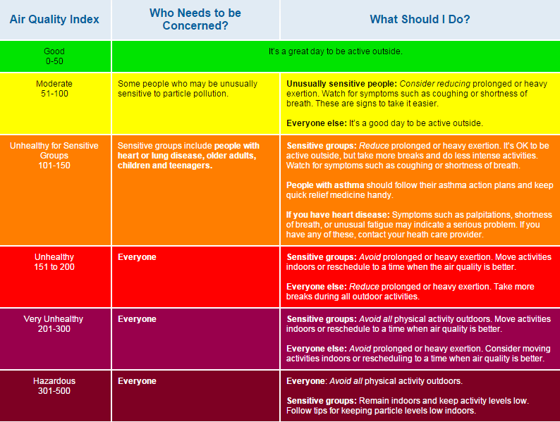
As you can see, there are various colored dots located across the map. These points are each tied to a physical monitor which automatically uploads data to this site in real time. Colors are based on the United States EPA PM2.5 Air Quality Index (AQI) ranging from green, yellow, orange, red, purple, maroon, and dark crimson. The corresponding meaning is provided below by the EPA.
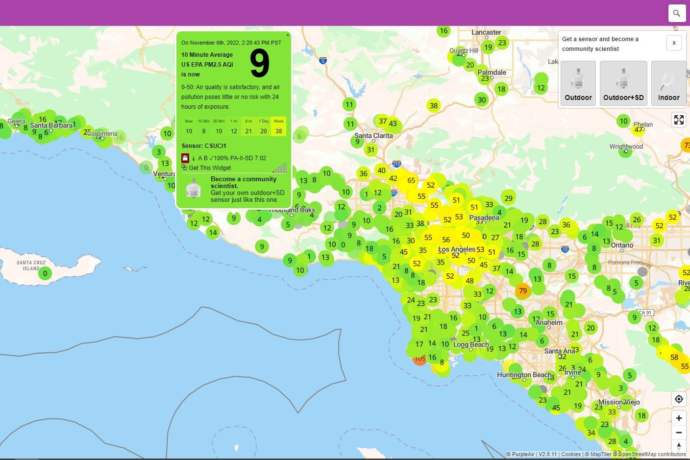
So you might be asking, what do these dots have to do with your data collection? Well I’m glad you asked! Because every dot holds the data for a single monitor, downloading a .csv file for each one in Ventura County would be….a lot of data, to say the least. To avoid downloading data that might not be as specific to our research questions, I thought it would be best to start with the monitors located in the same place as the Aeroqual monitors. This way, we can compare and identify the accuracy of the PurpleAir outdoor monitors, and account for that in our results.
After determining the accuracy I think the next best step pertaining to my research question would be to download and analyze data from Ventura County preschools, elementary/middle schools, and high schools. Understanding air quality patterns around these areas, and comparing them to incidents/cases of pediatric asthma, will allow me to identify any possible correlation between the two.





Leave a Reply